Quick Start
Options appear throughout Kodexa in metadata definitions for assistants, models, taxonomies (data definitions), actions, and pipeline steps. Here’s a simple example:How Users Experience Options
Options create interactive configuration interfaces in several areas:Assistant Configuration
When users add an assistant to their project, they can configure it through options you define: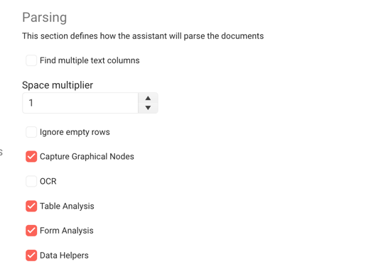
Document Labeling Properties
When labeling documents, users can set properties on labels based on options defined in your taxonomy:
Complete Option Types Reference
Kodexa supports 24+ option types organized into categories:Basic Input Types
string / text
A text input field with optional multiline support.lines(number): Number of lines for multiline input (default: 1)password(boolean): Mask input as password field (default: false)placeholder(string): Placeholder text when empty
- Password fields integrate with organization secrets
- Automatically switches between text input and textarea based on
lines - Secret references stored as
${secret.secretName}
number
Numeric input with optional constraints.min(number): Minimum allowed valuemax(number): Maximum allowed valuestep(number): Increment/decrement step (default: 1)
boolean
Checkbox or toggle switch for true/false values.- View mode displays color-coded badges (green for true, gray for false)
- Can specify custom labels for true/false states
select
Dropdown selection from predefined values.possibleValues: Array of{label, value}objectsmultiple(boolean): Allow multiple selections (default: false)
Code & Script Types
code
Full code editor with syntax highlighting.language(string): Programming language for syntax highlighting (default: “python”)height(string): Editor height (default: “300px”)
- Full code editor experience
- View mode renders as formatted
<pre>block - Scrollable with max-height in view mode
script / pythonScript / javascript
Script input for code snippets.Platform Resource Types
documentStore
Select a document store from the project.moduleStore
Select a module store from the project.tableStore
Select a data store from the project.taxonomyStore
Select a taxonomy (data definition) from the project.workspace
Select a workspace from available workspaces.showDescription(boolean): Show workspace description (default: true)
Document & Content Types
document
Search and select a specific document.- Live search with autocomplete
- Shows document path in results
- Returns
storeRef/documentIdformat - Configurable page size for results
data-form
Select a data form configuration from the project.Taxonomy & Label Types
taxon
Select a taxonomy element (data element).onlyGroups(boolean): Show only group taxons (default: false)allowEmpty(boolean): Allow empty selection (default: true)filterable(boolean): Enable filtering (default: true)
- Hierarchical taxonomy navigation
- Case-insensitive search across label and parent label
- Custom dropdown item rendering
taxon_label
Select a taxonomy label.taxon-lookup
Hierarchical taxonomy search with full path display.taxonomyTypes(array): Types of taxonomies to include (default: [“CONTENT”, “MODEL”])showFullPath(boolean): Show full taxonomy path (default: true)
- Flattens taxonomy tree for search
- Displays full path with parent labels
- Chip-based display with custom styling
- Excludes METADATA value paths
taxon_with_properties
Select a taxonomy element and configure its properties.taxonomyTypes(array): Types of taxonomies to includeadditionalOptions(array): Nested options for the selected taxon
- Two-tier configuration (selection + properties)
- Tabbed interface for additional options
- Recursive option rendering
- Stores both tag path and options object
Status Types
documentStatus
Select a document status from the project.attributeStatus
Select an attribute status from the project.clearable(boolean): Allow clearing the selection (default: true)
taskStatus
Select a task status from the project.- Color-coded badges with dynamic background colors
- Contrasting text color based on background
- Custom item rendering in dropdown
task-templates
Select a task template from the project.- Async data loading from project store
- Reactive updates when templates change
Cloud AI Model Types
cloud-model
Select a cloud-based AI model.showDescription(boolean): Show model description as hint (default: true)showProvider(boolean): Show provider in model name (default: true)
- Local storage caching (3-minute expiry) to reduce API calls
- Filters non-embedding active models
- Combines model name + provider for display
- Alphabetically sorted
- Paginated results (pageSize: 50)
cloud-embedding
Select a cloud embedding model.showDescription(boolean): Show model description (default: true)
- Filters for embedding models specifically
- API integration with pagination
- Dynamic loading state
Pipeline Types
pipeline
Configure an entire pipeline with steps.- Visual pipeline editor
- Drag-and-drop step ordering
- Step configuration interface
pipelineModelOptions
Configure options for models within a pipeline.showTabs(boolean): Organize options in tabs (default: true)
Display Types
alert
Display an informational alert message.markdown(text): Markdown content to displaytype(select): Alert style -info,warning,error,success
- Renders markdown content
- Dynamic styling based on alert type
- Material Design icons
article
Display or reference a knowledge base article.articleId(string): ID of the article to displaytext(text): Direct text content (alternative to articleId)slide(number): Specific slide number to display
- Integrates with knowledge base
- Slide-based navigation support
- Can display by ID or direct text
Specialized Types
chart
Select chart visualization type.type(select): Chart type -barorpie
label
Select or enter a document label.multiple(boolean): Allow multiple label selection (default: false)
- Fetches available labels from project
- Custom item rendering
- Supports future multi-select capability
simpleExpression
Enter a simple expression that can be evaluated.- Single-line text input
- Can be evaluated to compute a value
Working with Lists and Objects
Two of the most powerful option types arelist and object, which allow you to define complex, structured data. Understanding how to use these properly is critical for building flexible configurations.
List Options
Lists allow you to define arrays of values, either simple strings or complex objects. Usetype: list with the listType parameter to specify what kind of items the list contains.
String Lists
For lists of simple string values, usetype: list with listType: string:
type: listindicates this is an arraylistType: stringspecifies array items are stringsdefaultshould be an array of strings- Users can add/remove items through the UI
Object Lists
For lists of complex objects, usetype: list with listType: object and define the object structure using groupOptions:
type: listindicates this is an arraylistType: objectspecifies array items are objectsgroupOptionsdefines the schema for each object in the arraydefaultshould be an array of objects matching the schema- Each object in the default must conform to the groupOptions structure
Nested Lists in Objects
You can nest lists within objects for complex hierarchical structures:Object Options
Objects allow you to group related options together. Usetype: object with groupOptions to define the object’s properties.
Simple Object
type: objectindicates this is a structured objectgroupOptionsdefines the properties of the objectproperties.collapsible: truemakes the group collapsible in the UI- Each property in
groupOptionsfollows the same option structure
Nested Objects
Objects can contain other objects for deep hierarchical structures:Default Value Structures
Default values must match the type structure:| Type | Default Value Structure | Example |
|---|---|---|
string | Single string value | default: "localhost" |
text | Single string (can be multiline) | default: "Line 1\nLine 2" |
number | Single numeric value | default: 5432 |
boolean | Single boolean value | default: true |
select | Single value from possibleValues | default: "json" |
list (string) | Array of strings | default: ["item1", "item2"] |
list (object) | Array of objects | default: [{name: "val"}] |
object | Object with properties | default: {host: "localhost"} |
Examples of Correct Default Values
Anti-Patterns to Avoid
❌ DON’T: Use text fields for lists
✅ DO: Use proper list type
- Lists provide structured data that’s easy to validate
- Users get proper UI controls (add/remove buttons)
- Code receives properly typed arrays, not strings that need parsing
- Validation and error handling are automatic
❌ DON’T: Use text for structured data
✅ DO: Use object type
❌ DON’T: Mix default value structure with type
✅ DO: Match default structure to type
Real-World Example: Comprehensive Configuration
Here’s a complete example showing lists, objects, and nesting:Option Groups
Options can be nested into groups for better organization and user experience:- Organizes related options together
- Can be made collapsible to reduce UI clutter
- Creates a hierarchy of configuration
- Improves user experience for complex configurations
collapsible: true- Makes the group expandable/collapsible in the UI
Providing Possible Values
Limit user input to specific choices usingpossibleValues:
Conditional Visibility
UseshowIf to show/hide options based on other values:
username and password options only appear when use_authentication is checked.
showIf syntax:
- JavaScript expression evaluated against current option values
- Access other options via
this.optionName - Supports boolean logic:
&&,||,! - Comparison operators:
===,!==,>,<,>=,<=
Developer-Only Options
Hide advanced options from regular users:developerOnly: true are only visible to users who have enabled “Show Developer Tools” in their settings.
Feature Flags
Gate options behind feature flags:Common Option Properties
All options support these common properties:| Property | Type | Description | Required |
|---|---|---|---|
name | string | Unique identifier for the option | Yes |
type | string | Option type (determines UI control) | Yes |
label | string | User-facing display name | Yes |
description | string | Help text explaining the option | Yes |
required | boolean | Whether the value is mandatory | No (default: false) |
default | any | Pre-filled default value | No |
possibleValues | array | Allowed values (for select types) | No |
showIf | string | JavaScript expression for conditional visibility | No |
developerOnly | boolean | Only show to developers | No (default: false) |
featureFlag | string | Feature flag that must be enabled | No |
properties | object | Additional metadata (e.g., collapsible) | No |
Best Practices
1. Provide Clear Labels and Descriptions
2. Use Appropriate Types
Match the option type to the kind of data you’re collecting:list and object types instead of text fields. See the Anti-Patterns section in “Working with Lists and Objects” for detailed examples.
3. Set Sensible Defaults
4. Group Related Options
5. Use Required Judiciously
Only mark options asrequired: true if the component truly cannot function without them:
6. Leverage Conditional Visibility
Keep the UI clean by hiding irrelevant options:Using Options in Code
Python (Assistants/Modules)
Validation Example
Summary
Options are Kodexa’s declarative configuration system. By defining options in metadata, you:- Enable user configuration without writing UI code
- Provide type-safe input with automatic validation
- Create consistent experiences across all components
- Capture custom information tailored to your needs
- Keep configuration co-located with component definitions
Related Documentation
- Options Architecture: Deep dive into how the options system works
- Advanced Options Features: Complex patterns and advanced techniques
- Defining an Assistant: Using options in assistant definitions
- Data Definitions: Using options to add properties to data elements